Is Biden in Trouble? A Look at the New York Times' Latest Data
Last week, the New York Times released a series of surveys in four swing states that gained a lot of attention. This attention is not surprising, since it showed President Biden losing in five of six swing states. According to these surveys, Biden was losing Nevada by 10 points (he won by a 51-48 margin in 2020), Georgia by 6 points (he won by less than a point in 2020), Arizona by 5 points (he won by half a point in 2020), Michigan by 5 points (he won by a 51-48 margin in 2020), and Pennsylvania by 4 points (50-49 in 2020), while he was winning Wisconsin by 2 points (he won by less than a point in 2020). All of this is seemingly terrible news for Biden, but are these results to be trusted?

Credit: The New York Times
We have one year to go before the 2024 election and no one knows for sure what is going to happen between now and November 5, 2024. Anyone who tells you that they know is making a prediction - not based on factual information, but based on a guess. On the plus side for the prognosticators, there is a 50% chance they will be correct; but, even at 50/50 odds, it is still a guess.
For many Democrats, there was a 48-hour panic after these results were released that then subsided after Tuesday’s elections where Democrats did very well across the country. However, the question of whether these results are “correct” still remains. On the surface, there are some abnormalities that are worth mentioning. The biggest is that, in general, states don’t tend to shift dramatically in a vacuum and there tends to be an overall shift in patterns. States that share commonalities (geography, demographics, etc.) will typically move in a similar pattern compared to each other.
Given these usual patterns, it was interesting to see the results in the two Southwest states. In Nevada, Biden moved from a +3 in 2020 to -10 in the survey, a swing of 13 points. In neighboring Arizona, the movement was less than half of that total (about 5.5 points). Since Nevada has been much more supportive of Democratic candidates in the past, and Biden did better there in 2020 compared to Arizona, the expectation would be that Nevada would move away from Biden at a slower pace than its neighbor.
A similar phenomenon happened in the upper Midwest according to the Times’ surveys, where Biden is currently ahead by two points in Wisconsin (roughly double his performance in 2020) and down by 5 points in Michigan (an 8 point swing from election to the survey). Again, the usual patterns of movement are not holding, which is not impossible, but typically when a pattern is broken, there is a clear reason for it happening. This could be a big news event that is specific to one state (natural disaster, hyper localized economic change, etc.), or an unexpected change in the population patterns. None of these seem to apply to either the Southwest or to the Midwest.
There are other points in the data that can be pointed to as seemingly strange, but there is a bigger problem with how these surveys are being conducted and represented. For decades, the static survey has been the norm for polling. For example, the New York Times decides they want to do surveys in a set number of swing states and release them a year before the election. This all makes sense in the big picture; however, this approach is incredibly limited in that there is no context around the results other than the election results from the past or possibly some other survey results.
The challenge with this approach is that it comes from a world that no longer exists. Changes in opinion were relatively slower in the past. Most of this comes from the fact that there were limited channels of information that most people could access and there were specific times of the day that most people would receive this information. Now we live in a world where most people are being bombarded with information throughout the day and through more channels than we can count.
The other change is that participation in surveys is incredibly low. A few decades ago the ideal participation rate was over 40% (for every 100 households you called, 40 would participate in the survey). These days, we are lucky to get a 5% participation rate. This is not to say surveys are worthless, but the chances that you are getting a fully representative sample of people through the traditional approach is limited. Typically, researchers look at demographics as the way to ensure a representative sample, but what about other factors such as their overall mood? A person who is not feeling great about their economic situation, or is just having a down week, is either less likely to have a chat with a stranger on the phone or might be looking to express anger in any way possible.

Context is also not just about what is happening now, but also about what has happened in the past. Take, for example, the run-up to the 2020 election. The Trendency platform has been collecting data from Americans all across the country for over five years from now. On a typical day, we have more than 1,000 people logging into our site and answering a short series of questions about issues in the news, events, etc., which includes politics. This approach allows us to understand the dynamics of the movement that is occurring and put context around the results.
Back in late 2019, when President Biden was just candidate Biden (and not looking like the likely nominee), he was hovering around 40 to 41 percent average support, while then President Trump was in the 45 to 46 range. As you can see from the chart below, Trump’s support held relatively steady until July, when it started to decrease. Biden, on the other hand, enjoyed a big bump after securing the nomination in March and his support slowly increased from April through June. Following that, his levels of support spiked dramatically from July through the election.
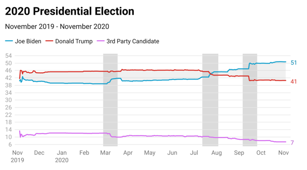
If we include the choice of a third party into the graph, the small shifts are harder to see, but the overall trend is clear on when Biden started to pick up momentum; it was a combination of Trump losing ground and those who said they were going to vote third party moving towards Biden.
Fast forward two years, we can see that the overall support for both candidates is lower than it was right before the 2020 election, but the overall dynamics of the race has held relatively steady since May, when the numbers tightened. Also worth noting is the high level of support for the third party candidate. Typically, unless there is a credible candidate, this is a protest vote and will drop to single digits by the time the election rolls around.

The charts above are all national numbers and, as we all know, do not reflect the exact method of how the United States picks its President. In some of the states in question, there certainly has been more day to day movement, but have the dynamics shifted as much as the New York Times suggests?
Looking at a few of the states where the Times released their surveys, a massive shift in dynamics is not what we are seeing. For example, in Nevada, the first part of the year was much more volatile. Both candidates have had a higher level of support than the other and they have been tied, but in June, Biden pulled ahead slightly and has held that position since. The two candidates are very close, but Biden down by 10 points is certainly not what we are seeing.

The results above also point to how different results can be based on when a survey is conducted. If a survey had been released in early March and it had the same results that we recorded, then Trump would have been ahead. Three weeks later, a survey would have shown that Biden was ahead. Without the understanding of the ebbs and flows of the data, these snapshots are not very helpful.

Moving south a little to Arizona, we find a race where Biden has been ahead since the beginning of the year, but it has moved into a near-tie since mid-September. Overall, the numbers right now are very reminiscent of the 2020 results in the Grand Canyon State, the same can be said of Nevada, which is in opposition to what the New York Times surveys were indicating.
Heading to the Midwest, we are showing a much more comfortable lead for President Biden, which has been the case for almost the entire calendar year. For most of the year, Biden had a 4 to 6 point advantage over Trump which then started to expand in June when Trump’s numbers started to slowly tick in a negative direction.
This is certainly a different picture than what the Times’ survey was showing. At the same time, the expectation would be for these numbers to tighten as we move through 2024 given the past results in Michigan.
The horse race is just one measurement, but it tends to be tied to other factors. One of these is how favorably voters view each candidate. These days, it is more common for elected officials to be underwater (their negatives are higher than their positives), which leads to the relationship between the two positions becoming more important than the numbers themselves.


If a candidate starts to gain ground in the horse race, we would generally expect to see a change in the dynamics about how the candidates are viewed. In our data, we are not seeing shifts in these numbers.
In Arizona, as an example, we find that Trump’s favorability ratings have been holding relatively steady over the past two years. The range on his unfavorable numbers has been about 48 to 50 and on the positive side it has been between 40.5 and 38. Certainly not what you could call dynamic changing.

For President Biden, we see a similar pattern of status quo. Biden’s unfavorable numbers have ranged between a high of 54 and a low of 50, while his favorable numbers have hovered around 37 for the entire year. Typically, an incumbent with a favorability of 37% would be in trouble, but when that incumbent’s challenger has basically the same ratings, it’s less of an issue.

In Michigan, Biden has been underwater over the past two years. However, the delta between the positive and negative closed slightly throughout 2022 and has held steady this calendar year. As the chart below shows, there has been very little movement on this rating during 2023.
For Trump, there has been more volatility in his numbers but nothing close to dramatic movements. From January 2022 to today his negatives have gone up about a point while his positives are down by about a point and a half. Certainly nothing to indicate a dramatic shift in how voters are viewing the former President.

The overall point here is not to say that the New York Times data is wrong, but that numbers released in a vacuum are an outdated method that needs to change. An understanding of where the numbers have been and the relationship between different positions is critical to truly understanding the dynamics of what is happening. This is true in just about every issue space imaginable and especially in politics.
What our analysis is showing is that this continues to be a close race in many states. Dynamics today are similar to what we saw earlier this year, and Biden is arguably in a stronger position than he was in early 2020. With less than a year to go, the outcome is not set in stone, but be wary of results that are simply a snapshot and instead focus more on the dynamics and relationships.
One thing we are comfortable in predicting is that it is going to be a long, painful, and ugly year when it comes to our political climate. Everyone should take a deep breath and get comfortable but be sure to keep your seatbelts fastened incase of unexpected turbulence.